
Second Street Brewery’s design team has just won some major national awards for craft beer can design, but the best part about the local Santa Fe brewery’s design team is that technically it’s a one-woman show, Mariah Cameron Scee.
Scee also designed the can for Pink Boots Society beer, Essential Pie, that was released today. I reached out to her Wednesday to get the story on her awards as well as talk about her slice of the Pink Boots beer.
DSBC: Which awards did you win recently?
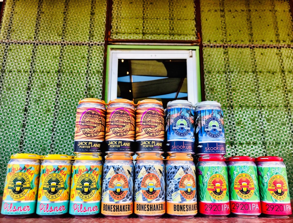
Scee: My designs for Second Street won three “Crushies” — Gold for Agua Fria Pilsner in the 8-to-12-ounce can design category, gold for the 2018 Skookum Limited Edition in the Best Can Packaging Design category, and the People’s Choice award for the 2018 Skookum Limited Edition in the Best Packaging Design category.
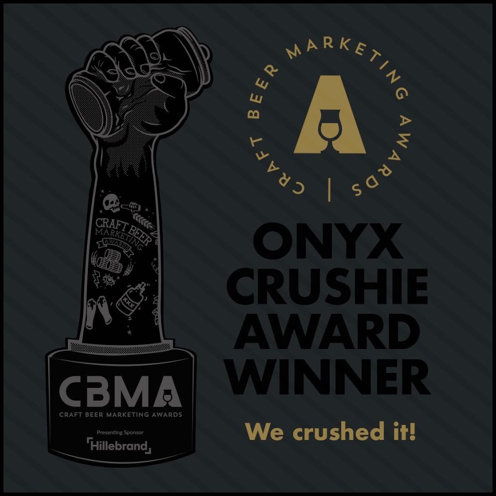
The Craft Beer Marketing Awards or “Crushies” are awards that recognize and celebrate “the very best marketing in the brewing industry across the USA,” according to their website. These awards are open to all independent craft breweries, their marketing agencies, and artists they employ. This year there were over 30 categories that “recognize all aspects of beer marketing.”
DSBC: What does it all mean to you personally and professionally?
Scee: Personally and professionally, it means a lot to be recognized for my work. Having these designs selected by a team of judges is huge to begin with, and seeing our cans win alongside some big breweries and design teams from across the country was really fucking cool.
DSBC: Can you tell us (briefly) about the designs and inspiration?
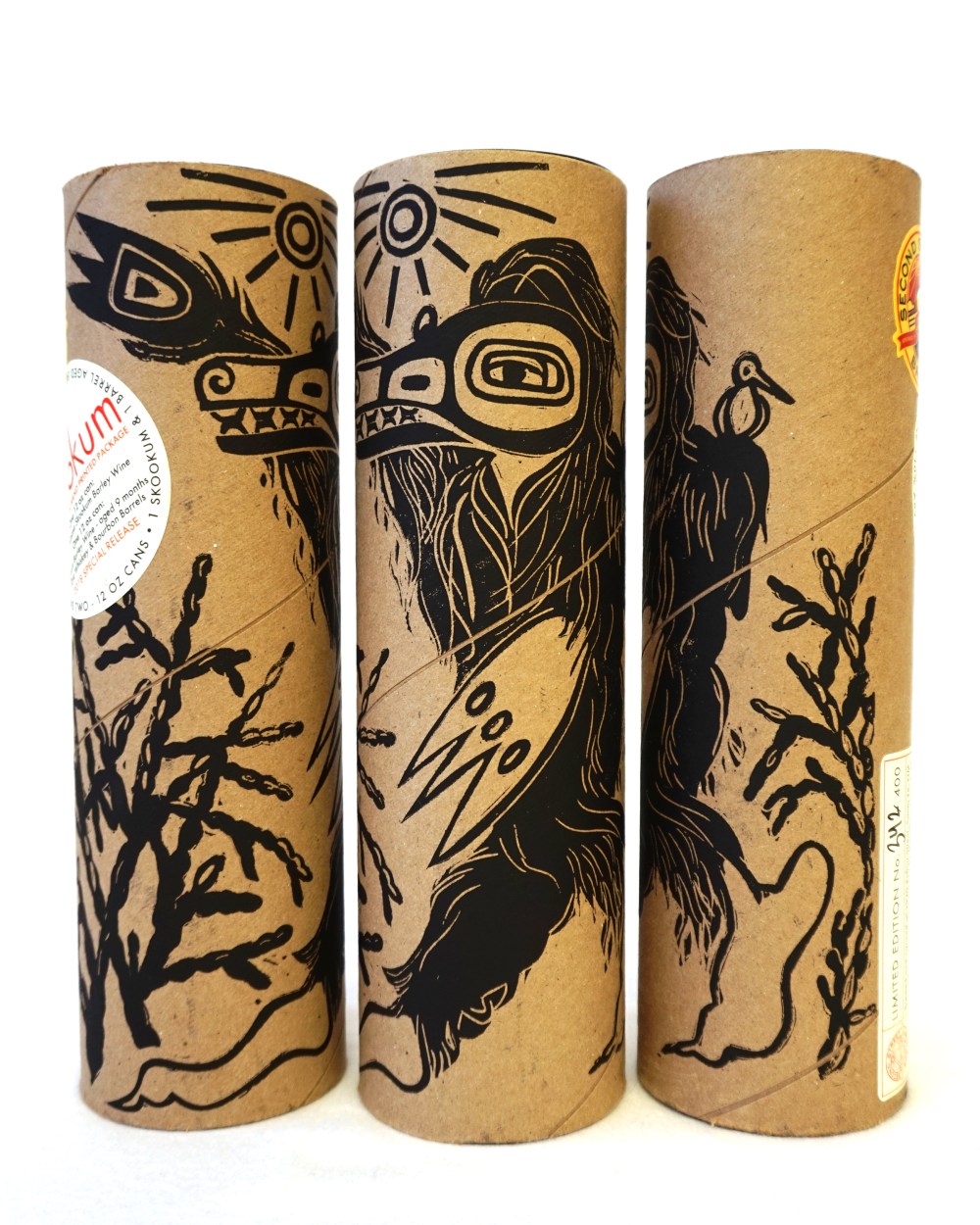
Scee: (I like how you said “briefly” there, good call, Luke) The Skookum package was a big project. In short, I came up with the design, carved a relief block, and printed each one by hand by rolling the cardboard tube across the inked block. Inside are two cans of Skookum Barleywine, with my designs as well.
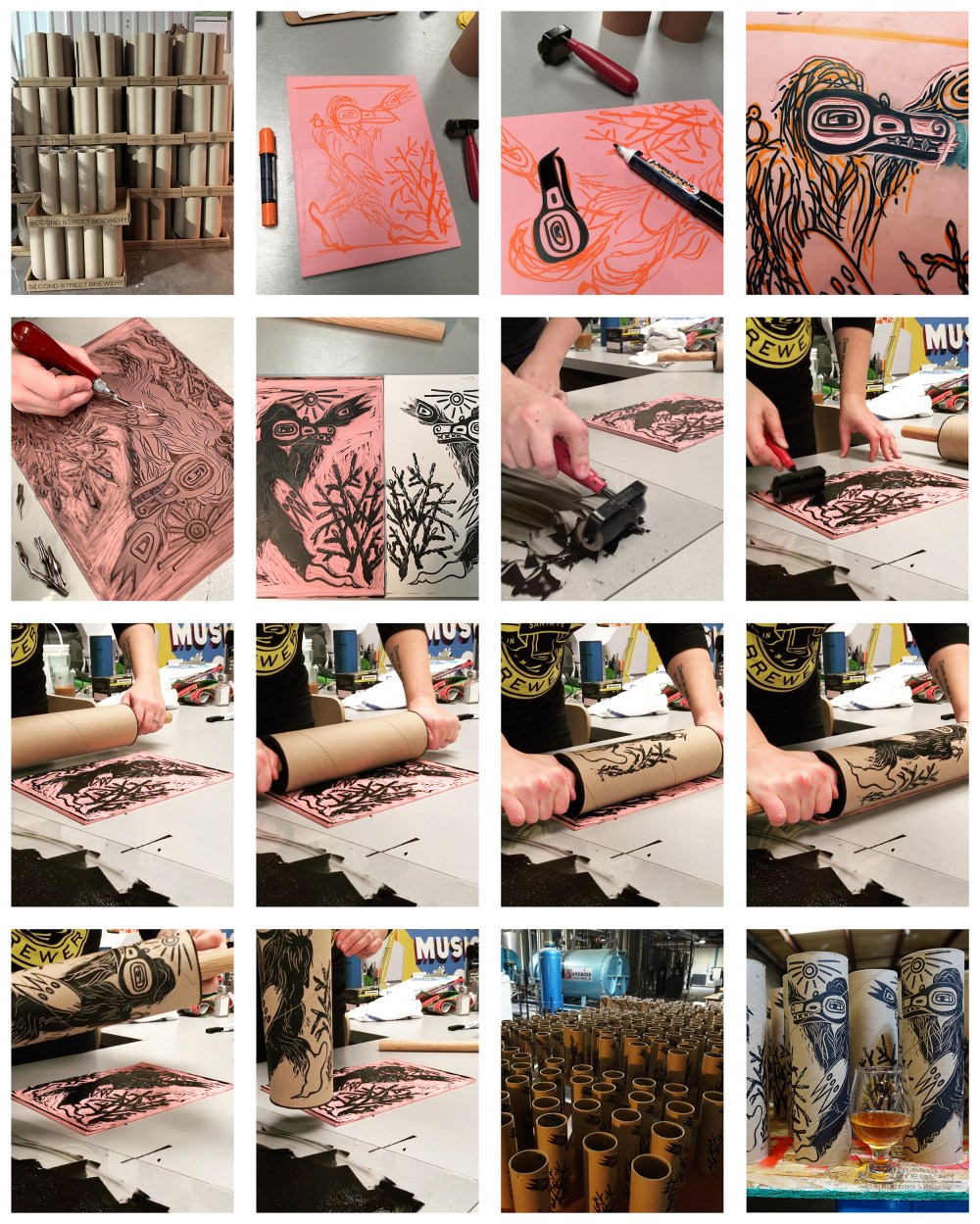
I need to say, though, that a project like this doesn’t happen with one designer working alone. It was a serious team effort and the credit goes to all! From Rod (Tweet) developing the idea of Skookum Barleywine, Steve (Anderson) suggesting the idea of a two-can package while we were standing around drinking beers at GABF, Todd (Yocham) bouncing ideas back and forth with me about the physical packaging and labeling, and Ben (Murdock) who cut 400 cardboard tubes on the table saw, to Tom (Ludzia) who had a hand in everything from moving the beer out of barrels to getting the cans into the packages at the end.
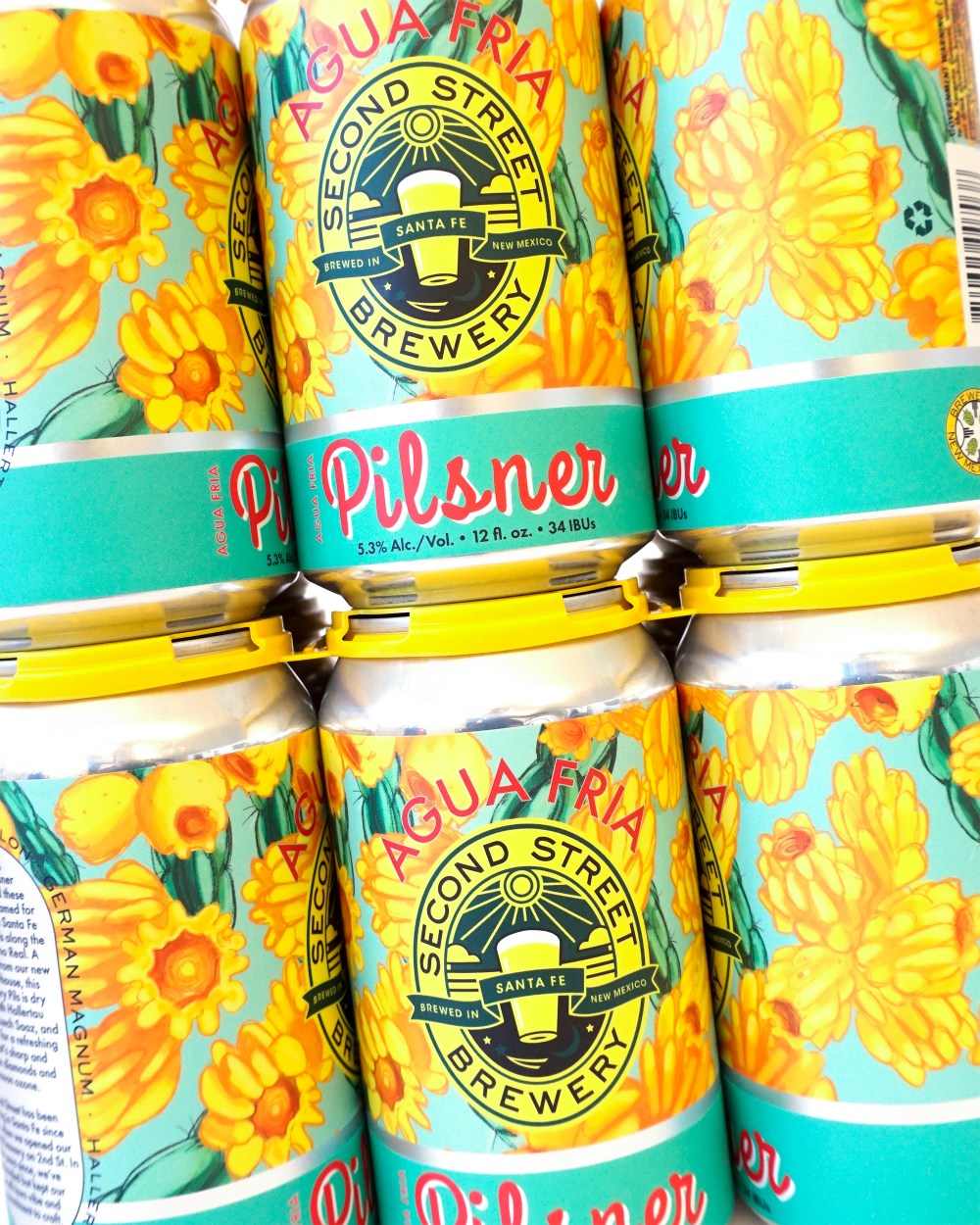
The Agua Fria design is more straight forward, inspired by the bright yellow fruits of our local cholla cacti, a plant both loved and despised, depending on who you ask.
Creative Director Mariah Scee has been with Second Street Brewery since December of 2016. She took on the enormous task of handling all art and marketing for the company (three businesses) in December 2017, and she’s been in her current role since April 2019.
She graduated with a BFA from Rhode Island School of Design, and has previous work experience with art and design, as well as in the restaurant and beverage industry. For her, this role really pulls all of that together.
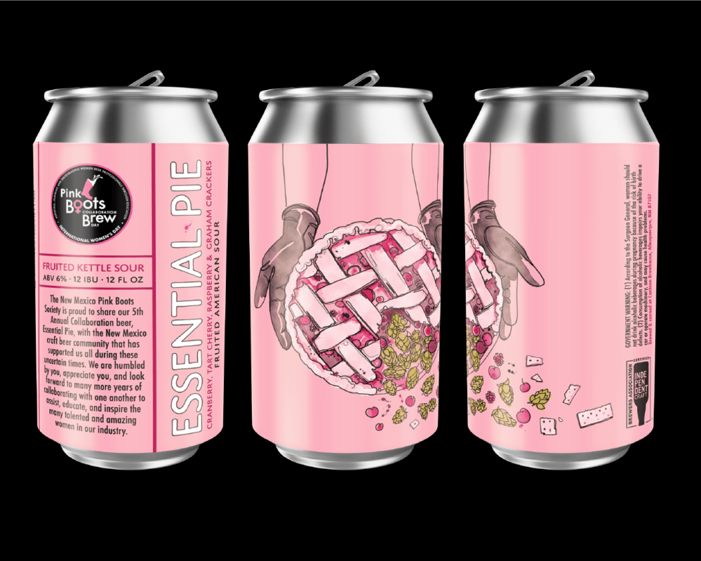
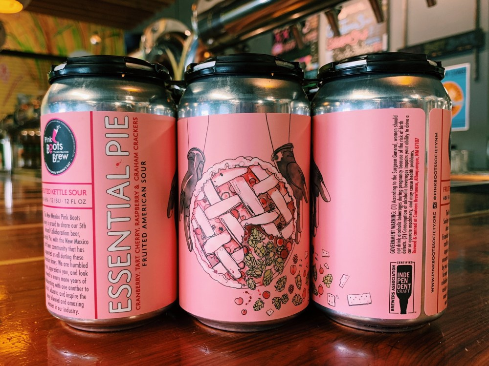
Pink Boots Society Can
DSBC: Tell us about the Pink Boots Society beer that you designed a can for.
“Essential Pie” is the 2020 collaboration beer for the New Mexico chapter of the Pink Boots Society. The beer itself is a fruited kettle sour with raspberry, cranberry, tart cherry, and loads of graham crackers, and was brewed at Canteen Brewhouse.
DSBC: What was the inspiration/process?
Scee: When Jess (Griego, PBS NM chapter lead) contacted me about doing the can design, she and Jamie (Schwebach of Canteen) had three working names for the beer. “Essential Pie” was perfect, short and catchy, relevant to the current times and to the beer. It inspired the graphics on the can, with the gloves being a nod to our COVID-19 reality, as well as to the black gloves brewers wear.
DSBC: What does it mean to you to be part of this great collaboration?
Scee: I loved that I could be a part of the collab brew in a way that used my specific skill set. I missed the brew day for the beer here in NM, but I was at the National PBS meeting in Denver where we chose the hop blend that is used in every 2020 Pink Boots collab brew. It’s exciting to come full circle to our local beer, using that hop blend, with my art on the can.
DSBC: What does it mean to be a woman in this predominantly male industry, and in our New Mexico brewing industry specifically?
Scee: That could be a whole article on its own! But, to keep it short, I think that in this industry, like in other male-dominated fields, you have to work harder and be louder to get a seat at the table. There are often not as many seats for women. But, I also think it’s a rewarding industry for us. In many or most cases, we are heard, respected, and we have the ability to lead and inspire other women.
* * * * *
DSBC: How important are cans nowadays?
Scee: So important! Perhaps less so for large companies with long-established branding, but for the smaller breweries, I think that they are often what catches a new customer’s eye. They give your company a sense of personality, influence the demographic that buys your product, and excite the drinkers who collect new releases.
DSBC: How do you feel can design helps shelf sales?
Scee: Beyond grabbing the customer’s attention, can design also feeds brand loyalty. If you have a well-designed and unique family of cans, a customer can pick your brand out easily on the shelf, they know if it’s a new release or an old favorite without having to even read the can. It’s in the graphics.
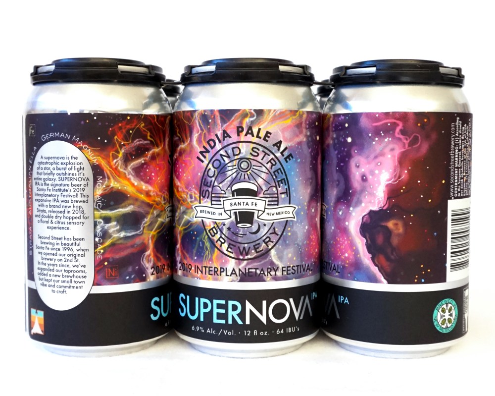
DSBC: Which can design (of yours) is your favorite and why?
Scee: I would have to say Supernova IPA for the 2019 Interplanetary Festival. When I look at it a year later, I still feel like I made the best can possible for that beer. The design is tight, it’s a nod to my inner typography geek, but it’s also illustrative and makes me want to join NASA.
DSBC: Do you have a favorite design from another brewery?
Scee: There are individual cans I love, but to me, it is more about breweries whose cans as a family are just phenomenal. Some of those: Against the Grain for the illustrations; Grimm Ales for the creativity and often quiet design; Foam Brewers for their use of die cut labels alongside lettering/illustration; Austin Beerworks for being fabulously iconic; and Canopy for their exquisite corpse inspired labels.
Big congratulations to Mariah Scee for being recognized for her excellence in a huge field of tough competition. And huge thank you for always taking the time out of her busy day to answer the Dark Side’s questions. Thanks for all that you do. To your awards, continued inspiration, and to your health, salud!
Luke

For more @nmdarksidebc news and unfiltered Untappd beer reviews, follow me on Twitter @SantaFeCraftBro.

One Comment Add yours